


By SUZANNE DOWNING
Aug. 9, 2026 – Once upon a time, WhiteHouse.gov began as a modest “gateway to government.” Three decades later, it has become a fast-moving showcase of presidential power, policy, and patriotic imagery.
WhiteHouse.gov is not your grandma’s website. The White House website has never looked quite like this.
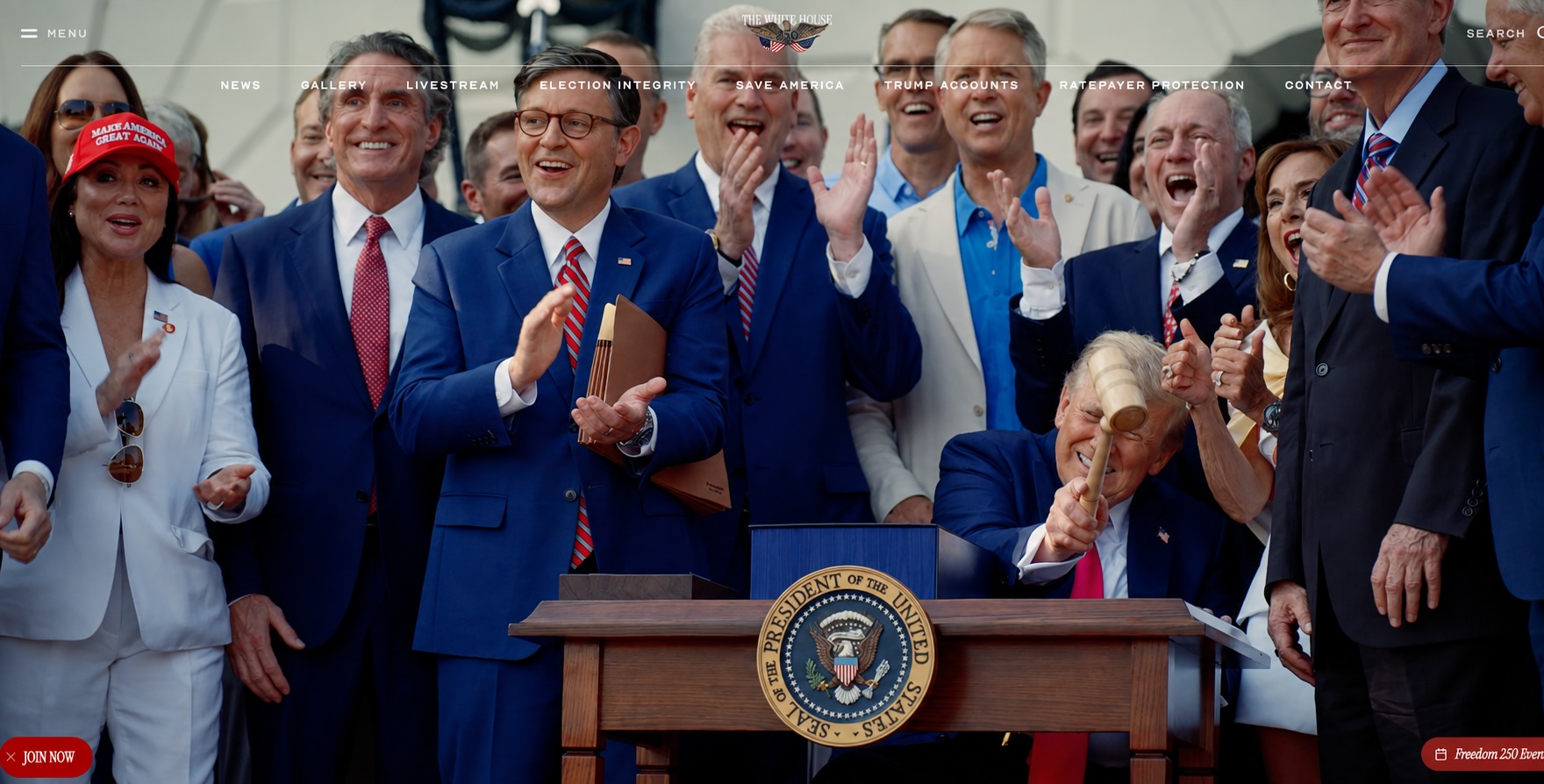
Open WhiteHouse.gov today and the experience is closer to a cinematic campaign trailer than the sober government portals of years past. Video rolls across the screen. President Donald Trump appears amid helicopters, military aircraft, American flags, salutes and photogenic images of the nation, one where eagles soar, music builds and policies are presented not simply as documents to be downloaded and read, but as stories to be watched.
The current website is bold, fast-moving and unapologetically promotional of the America First agendaand the restoring of America. Its vivid colors, dramatic imagery and tightly edited videos communicate the central message of Trump’s second term: America is strong, its president is in command and a new “Golden Age” has begun.
That is a remarkable evolution for a website that began in 1994 with simple navigation, small photographs, flag graphics and even an audio recording of Socks, President Bill Clinton’s cat, meowing.
WhiteHouse.gov made its debut during the Clinton administration, when most Americans had little or no experience with the World Wide Web. The White House Historical Association says the early site was conceived as a “Gateway to Government,” introducing visitors to the presidency, the White House building and the federal government.
It was adequate for the times, but by modern standards, it was primitive. Pages loaded slowly over dial-up connections. Graphics were small and layouts were basic. But at the time, placing the White House online was groundbreaking.
The site presented the White House as three things at once: a national monument, the home of the president and the center of the executive branch. It offered speeches, photographs, historical information and material for children. Socks became one of its unlikely digital stars. The Clinton Presidential Library notes that the site included an actual audio file of the first cat meowing.
That early version now looks like an artifact from another civilization, but it established a pattern that continues today. Every president inherits the same web address, clears away much of what came before and rebuilds it to reflect his own political identity.
Under President George W. Bush, the site became more structured and institutional. Blue, white and gray dominated the design. News summaries, presidential speeches, policy descriptions and official photographs filled the pages. Following the terrorist attacks of Sept. 11, 2001, the website also became a source for homeland-security information and updates on the war on terrorism.
The Bush-era site was more polished than Clinton’s, but it remained largely text-driven. Its purpose was to provide information, archive presidential activity and direct visitors toward government resources. It looked like a government website because that was precisely what visitors expected a government website to look like.
President Barack Obama arrived at the White House as social media and smartphones were changing how Americans consumed news. His administration gradually modernized WhiteHouse.gov, integrating video, email signups, social-media sharing, issue pages and more sophisticated navigation.
In April 2015, the Obama White House launched what it called the first fully responsive White House homepage. That meant the page could automatically adapt to desktop computers, tablets and mobile phones rather than forcing smartphone users to struggle with a site designed for a large monitor.
Trump’s first administration took over the domain at noon on Jan. 20, 2017. The outgoing Obama material was transferred into an archive, while Trump’s team replaced the homepage with new branding, administration biographies, policy priorities and an “America First” message.
That version was more conventional than the website Trump operates today. It used strong photographs and distinctive branding, but its structure still resembled the established White House formula: presidential news, speeches, executive actions, issue pages and historical information arranged around a largely static homepage.
The next transition brought another sharp turn.
President Joe Biden’s team rebuilt the site in approximately six weeks for its Inauguration Day launch in 2021. The new version used abundant white space, large blocks of color and an updated White House logo with more architectural detail.
The Biden site emphasized accessibility and inclusion. It offered controls for higher contrast and larger type, restored a prominent Spanish-language option and added an optional pronoun field to the White House contact form. Its designers described WhiteHouse.gov as the administration’s “digital front door.”
The Biden website was modern, mobile-friendly but relied heavily on written descriptions of policy priorities, presidential remarks, administration announcements and curated photographs.
Then came Trump’s return.
Within hours of his inauguration as the 47th president on Jan. 20, 2025, the Biden site disappeared into the federal archives. In its place was a dark navy-blue homepage dominated by a photograph of Trump and the declaration: “AMERICA IS BACK.”
The initial replacement was relatively simple, reflecting the compressed timetable of a presidential transition. It directed visitors toward Trump’s early executive actions, Cabinet members and America First priorities, including border security, energy production, economic growth and national defense.
But the site did not remain static. During Trump’s second term, it has evolved into something more ambitious and theatrical.
Video is no longer an occasional supplement to the written material. It is one of the site’s primary languages. Short-form productions and highlight reels present the president, the military, American industry and the nation’s landscape through the visual vocabulary of movie trailers and high-end advertising.
Major policy themes, including securing the border, growing the economy, strengthening national security, unleashing American energy and making America healthy again,are presented through strong imagery and concise declarations. The homepage also incorporates the administration’s Freedom 250 celebration and video series devoted to America’s founding.
There is still a large volume of traditional government material beneath the surface. Visitors can find presidential actions, executive orders, proclamations, fact sheets, briefings, transcripts and official biographies. But the front page no longer feels primarily like an index to documents. It is designed to make an immediate emotional impression.
The shift mirrors a broader change in American communications. Millions of people now receive news through brief videos, social-media clips and streaming platforms rather than newspaper articles or government news releases. A website that does not capture attention within seconds risks losing its audience.
Trump, a former television personality with an instinct for visual branding, has carried that lesson into the White House’s most important digital property. The result is a website that presents the presidency as an unfolding production as well as an institution of government.
The redesign also comes as the administration presses a broader effort to improve the federal government’s online presence. In August 2025, Trump announced the “America by Design” initiative, calling for federal websites and other public interfaces to be made both more usable and more attractive.
WhiteHouse.gov illustrates what can happen when that philosophy is applied not merely to functionality, but also to political communication.
Presidential websites have never been neutral. Every administration decides which accomplishments to feature, which issues to emphasize and how the president should be presented to the country. What has changed is the intensity and sophistication of that presentation.
Clinton’s White House invited Americans to hear Socks meow. Bush offered orderly columns of news and security information. Obama made the site responsive to the smartphone era. Biden emphasized diversity and inclusion. Trump’s second White House uses video, motion and patriotic spectacle to project energy and power.
The National Archives preserves the former White House websites, allowing visitors to move from Clinton’s early experiments through the Bush, Obama, first-term Trump and Biden administrations.
Taken together, the archives show how WhiteHouse.gov has progressed from an online government brochure into one of the presidency’s most powerful storytelling platforms.
The address is the same. Everything else, from the technology to the tone to the definition of presidential communication, has changed. And this one may be the best one yet.


2 thoughts on “From Socks the Cat to multi-media Trump: The White House website has evolved into a digital stage”
Downing, shouldn’t you provide attribution for the information you’ve borrowed from someone or AI? It’s your byline, but …
Not sure if there’s anything, ie: logic – reason – common sense, that would convince you otherwise.
I’m guessing, and it’s a purdy good guess, that anything a conservative provides won’t be enuff.
Kinda like my X-Wife … It’s just best to separate and go different directions.
If not(?), meet me on the Kenai River and I’ll take you for a boat ride.